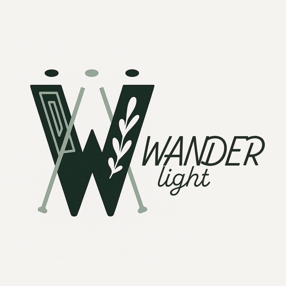
Logotype #1

Logo Symbol
The 'Wanderlight' brand logo is built on a heartfelt commitment to transforming spaces with photographs through three guiding principles: Connection, Whimsy, and Grace.
Connection: Art is the starting point of conversation, a quiet bridge between people and stories. 'Wanderlight' is more than a gallery; it’s a gathering place. Each photographic print is a curated moment that invites reflection, evokes memory, and connects individuals through shared emotional resonance.
Whimsy: Rooted in the charm of a vintage dreamscape, 'Wanderlight' photographs offer a soft escape into the extraordinary. Much like the delicate branch woven into the logo or the crossed lines of imagined paths, each piece transforms a space into something gently surreal, where beauty is seen through wonder and nature whispers of far off places.
Grace: While playfulness is present, every composition is steeped in quiet elegance. 'Wanderlight' strikes a rare balance, refined yet approachable, nostalgic yet timeless. It’s about curating visual poetry that feels both grounded and ethereal, enhancing the atmosphere of any room with a thoughtful, graceful presence.
ELEMENTS SYMBOLISATION -
Abstract Frame: A minimal geometric frame representing curated, high-quality framed prints at the heart of 'Wanderlight.'
Leaf Motif: A soft, organic leaf symbolising naturalistic photography, calmness, and serene visual storytelling.
Intertwined Lines + Three Dots: Dual meaning, an easel-like form hinting at artistic creation, and three connected dots symbolising community and togetherness.

Monogram Colour #1

Monogram Colour #2
The monogram design reflects qualities of confidence and ambition, utilising the typefaces Whomp and Akaline. These typefaces demonstrate unique structural elements - stems, spurs, open counters, spines, and ascenders, that seamlessly align the letters 'S' and 'P,' making them feel intrinsically connected.
The typeface Whomp embodies ambition with its bold, geometric forms and playful curves. Its exaggerated width and sweeping arcs showcase creativity and fluidity, creating a dynamic personality. The confident stance of the 'S' is emphasised by its large, open counters and smooth curvature, which lend it a stable yet fearless presence.
On the other hand, Akaline compliments this ambition with a contemporary, clean aesthetic. Its slender strokes, balanced proportions, and sleek spurs exude understated confidence. The 'P' is particularly striking, with its open counter and refined, rounded structure that harmonises perfectly with the curves of the 'S.'
Together, these typefaces balance each other’s characteristics. Whomp introduces a bold, energetic flair, while Akaline provides a poised and modern contrast. The simple yet intentional positioning of the letters underscores their synergy, ensuring they feel like they were always meant to stand side by side. The monogram’s carefully chosen typefaces work together to assert confidence and ambition in a cohesive, visually striking design.

Logo Symbol White

Logo Symbol Grey
This logo is a minimalist visual representation of analogue photography, inspired by the shape and proportions of a 110 film camera. The design is made up of three horizontal bars that work together to subtly form the silhouette of a compact film camera.
The top burnt orange bar suggests the line of the shutter or viewfinder, referencing the tactile, hands-on nature of shooting with film. The long olive green bar in the centre represents a strip of 110 film. Its length gives the feeling of a continuous sequence of frames and reflects the storytelling aspect of photographing moments on film. The navy bar beneath it, featuring a small white square, conveys a single film frame and highlights the idea of capturing one intentional moment at a time.
The warm, earthy colour palette of olive green, navy and burnt orange evokes nostalgia and hints at the tones of vintage film, darkroom processes and analogue equipment. The simplicity and balance of the shapes reflect the deliberate and thoughtful process of shooting on film. Overall, the logo represents a brand that values intentional imagery, analogue craft and sharing film photographs with authenticity and purpose.